Design Presentations With Ease
Using The Right Colour Scheme In PowerPoint Presentations
Sometimes people shy away from PowerPoint saying, “I’m not good at design”. I’m not an artistic or creative person and therefore put PowerPoint presentation in the too hard basket. Perhaps even delegating the task to others.
There are features built into PowerPoint for exactly that reason. You don’t have to know about design and style. Even the pain of choosing the right colour is sorted for you just choose a theme. This is often the company corporate them colour palette.
Using The Right Colour Scheme In PowerPoint Presentation
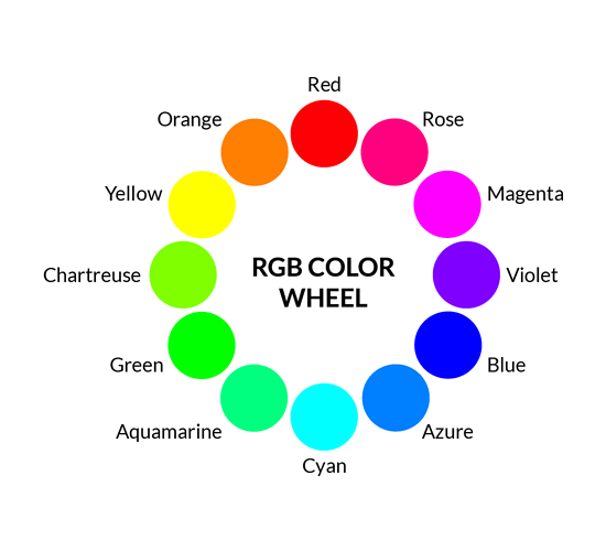
If your organization has their own colour scheme using the RGB colours. Start by getting in contact with the marketing person and get those numbers. Red could be 192, Green 228 and Blue 116 for example.
These are entered in the Shape Fill command under custom. Your organisation may even have their own PowerPoint Design template. That’s all the mystery taken out the colour palette to use.
Now it’s down to content. OK you will have to know what you are talking about here but structuring the text, so it looks inviting is all smoke and mirrors. What I mean by this is – the Design Ideas command does this part for you.
Type some text with bullets and sub bullets. You’ll find the Design Ideas button in two places. Home and under Design. Ensure you have the slide selected that has the bulleted text. Now press Design Ideas. You will now be presented with an assortment of slide layouts that you have never seen before.
In fact, these layouts you are presented with right now don’t even show up under New layout.

Four Helpful Tips For Good Looking PowerPoint Presentations
- Less is more. Don’t feel you have to fill the slide with contents be it text or pictures.
Think of allowing room for white space. - Follow the 5/5/5 rule . No more than five words per line of text, five lines of text per slide, or five text-heavy slides in a row.
- Convert some bulleted text to Smart Art.
Get your message across visually - You can use animation and it can be great but depending on your audience and the subject matter it’s not always necessary.
The video below will show you how to implement good looking PowerPoint slides.

Grow With Google By Google
I attended a Google presentation at Cronulla RSL Woolooware on “Grow with Google”, I found it very informative and it was free. I was impressed with their PowerPoint presentation.
The background was white. There wasn’t any fancy fly in and out effects or transitions. Regular bullet points and not overcrowded in fact about 8 bullet points max. A Few slides had imagery to explain concepts.
Delivery by the presenters is also key to a good PowerPoint presentation. They explained and read out the bullet points but elaborated and explained. I also noticed because the bullet points were only a few they could get away with not fading or hiding them.
They spoke calm and clear not rushed. They wore jeans and a Google T-Shirt in keeping with the Google feel.
The presenter’s delivery is just as important and the PowerPoint itself. You can read off the screen but, in the end, you need to also know your material.

Create Your Own Layout
In my 24 years of experience as a Facilitator in Microsoft Office products I have come across PowerPoint presentations where slides were constructed by starting with a Blank layout and inserting text boxes. I understand that is may have been done initially because the layouts did not suite.
However, this causes big problems down the track. Imagine you now need to change all the title placeholders and make them a different colour or font. You would have to go to each slide to make this change. Whether you use the Format Painter or do this manually it is still time consuming.
NB: The Format Painter is a tool that can be found in all Microsoft Office products that applies the formatting ONLY from one piece of text to another.
Consistent Formatting For Slides
Using the Slide Master which is found under View then Slide Master will solve this problem.
In hear you will find a Master for each Side Layout Master. Ensure before you start to slide all the way to the top and select the very first layout. It should be larger than the ones below it and slides below should be indented.
Remember this is just for formatting. Changing Font, Size, Colour, Bullet styles etc.
If the layout you are after is not presented here, it’s ok you can create your own.
Go to the end of the indented layouts press Insert Layout. You will now construct your layout out of common place holders like, Text, Picture, Chart, SmartArt etc. Press Insert Placeholder and drag diagonally to create your shape.
To finish up by naming your layout. Right clicking on your layout and selecting Rename. You can create as many different ones as you like. Once you close Master View. Select New Slide and at the very bottom you will find the Layout you created and named.
Using the Slide Master will ensure you have that consistency in Formatting all the placeholders form one Slide to another will always line up.
Convert Text To SmartArt
When you are interested in improving the visual appeal of your PowerPoint presentation and currently it has way too many slides with bullet points and text. Consider converting some of those bullet points into SmartArt graphics.
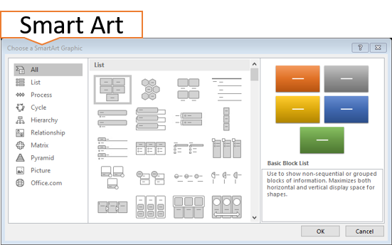
Select the bulleted text then from the Home tab select Convert SmartArt Graphic simply choose from any of the design presented to you or choose More SmartArt Graphic and choose from a wider range.
Take note that some of the designs you choose may have limitations like the Funnel graphic has a limit of four lines of level 1. When in doubt read the comment on the right when you select a graphic.
The YouTube below will guide you through the converting text to SmartArt process.
Storing Pictures In A SmartArt Graphic
If what you are after is graphics with the capability to store a picture. You could look at each category from the SmartArt dialogue or better still choose picture from the category area. This will have a collection from all the categories that will hold pictures.
This saves you time going into each category to find a SmartArt with a picture option.
By adding pictures to your presentation, you break up the boring amounts of text with visual aids. Consider enhancing your picture by adding a picture style such as a Black/White frame, Shadow effect or reflection.
Try inserting a shape then through Shape Fill select Picture which you can access via the Internet, your own files or use Icons. Then strategically position your picture appropriately.
When cropping pictures, the full file size remains, if this becomes a struggle you can compress the picture by selecting Delete Cropped Areas of Pictures. This will ensure that the picture file size is reduced, and you will not be able to get back the cropped areas of your picture.
The best tool for capturing screen shots is Screen Clipping which is found in all Microsoft Office products but recently I discovered a shortcut key. Screenshot is like the Snipping tool that most people might know.
The Shortcut Key is Windows icon, Shift S. Then Paste into which ever application you need.

Effective Animation
I have seen some PowerPoint presentations in my time of being a Microsoft Office facilitator where people have gotten carried away with technology and it overpowers the presentation. If you would like to use animation you will need to consider your audience and the subject matter being delivered.
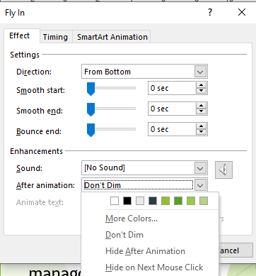
If you have 8 bullet points for example rather than displaying all your cards at once, try Effect Options. Select and effect like Fly In then from the Animation pane select the drop-down arrow next to your effect and choose Effect Option. You will see three tabs, choose Effect tab and under enhancements select the drop-down arrow for After animation and select Hide on Next Mouse Click.
This technique allows the facilitator to have control of what the audience reads and when. Retaining the audience focus on what the facilitator is explaining. If you prefer to see the bullet point after you have read them out or explained them then try setting a colour. The idea here is to choose a faint colour so only you the present can see this from up close and less obvious to your audience seated further away from the screen.

Conclusions
When creating your PowerPoint presentations don’t feel that you need to fill the slide with text or pictures. Less is more. A way of achieving this is to convert some of the bulleted slides into SmartArt graphics instead. Get creative but not corny when using shapes to insert pictures.
To create consistent formatting make sure you use the dedicated layouts and change the formatting using the Slide Master.
Not every presentation needs to have transitions and animations. Consider your audience and subject matter being presented.
Microsoft Office Small Group Training Sessions
AZ Solutions delivers customized training courses in Sydney – Australia. We come to you. All you need is a board room, PC’s for each student and a TV/ Projector with a HDMI connection cable. Virtual Training sessional also available.
In our training sessions you are welcomed to bring examples of your work to class. We prefer it.
Call Now M 0414 417 059 visit www.azsolutions.com.au


